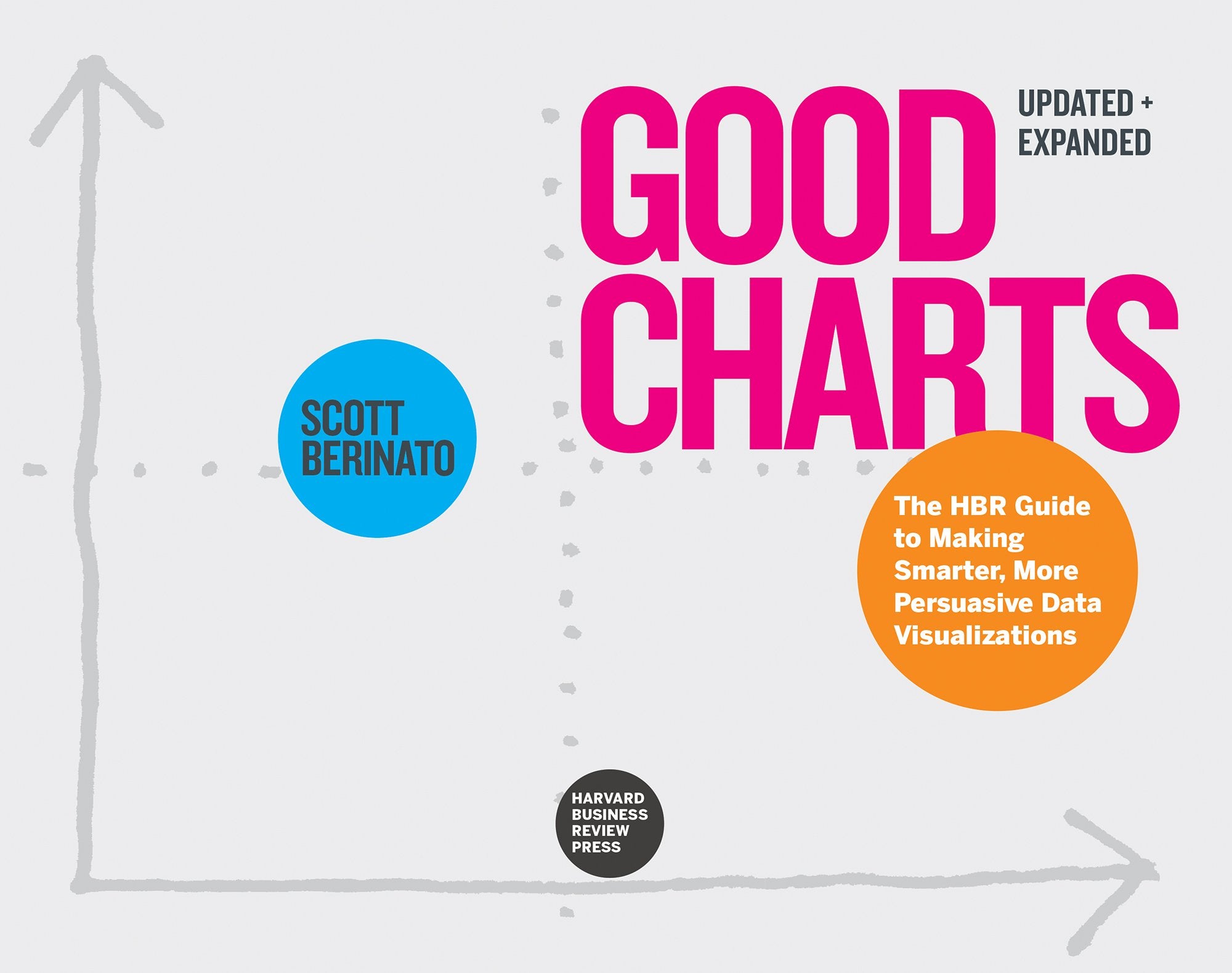
Description
Condition: BRAND NEW
ISBN: 9781647825133
Format: Trade paperback (US)
Year: 2024
Publisher: Harvard Business Review Press
Description:
The ultimate guide to data visualisation and information design for business.
Making good charts is a must-have skill for managers today. The vast amount of data that drives business isn't useful if you can't communicate the valuable ideas contained in that data — the threats, the opportunities, the hidden trends, the future possibilities.
But many think that data visualisation is too difficult — a specialist skill that's either the province of data scientists and complex software packages or the domain of professional designers and their visual creativity.
Not so. Anyone can learn to produce quality 'dataviz' and, more broadly, clear and effective information design. Good Charts will show you how to do it.
In this updated and expanded edition, dataviz expert Scott Berinato provides all you need for turning those ordinary charts kicked out of a spreadsheet program into extraordinary visuals that captivate and persuade your audience and for transforming presentations that seem like a mishmash of charts and bullet points into clear, effective, persuasive storytelling experiences.
Good Charts shows how anyone who invests a little time getting better at visual communication can create an outsized impact — both in their career and in their organisation. You will learn:
A framework for getting to better charts in just a few minutes
Design techniques that immediately make your visuals clearer and more persuasive
The building blocks of storytelling with your data
How to build teams to bring visual communication skills into your organisation and culture

